This fall I was commissioned to illustrate the cover for a mid-grade book called Wily, The Canine Pandemic by Michelle Weidenbenner. The story is about a geeky eleven year old boy who invented a machine that could save the canine race, but if he uses his device he might never see his family again. The book is for ages 8 - 12. Available on Amazon.
From the description I was given, the story included many elements of sci-fi, including space ships and centaurs. As an avid fantasy and sci-fi reader myself, I was intrigued by the story from the get go, so I jumped at the chance to illustrate the cover. Today, I want to share the entire process that went into making this illustration.
Thumbnail Sketches
First 4 initial Thumbnail Sketches
The first step was to immerse myself in the story. I was sent over the manuscript and dived right in. Although the story was still in the editing phase, I was able to read the preliminary script. I was completely swept away by the main character, Wily and his charge to save the canine race.
As I read through, I was filled with visions of all the cover possibilities. I began sketching and exploring my ideas. I narrowed them down to four thumbnail sketches to send to my client. All of my thumbnail sketches are drawn digitally. I like the ability to be able to sketch and easily manipulate what I'm working on.
Final Thumbnail Sketch
In each sketch, I wanted to explore the different emotions the story hits upon and emphasize different elements. The client ultimately choose the third sketch, but had me add a couple more of the main characters to it. In this sketch, I wanted to highlight the machine Wily builds. This is a particularly important piece to the story. I really loved how vividly it was described in book, and I liked the idea of bringing that to life. I had to be careful not to give away too much information about what it does, so I knew I was tiptoeing a fine line with what I show.
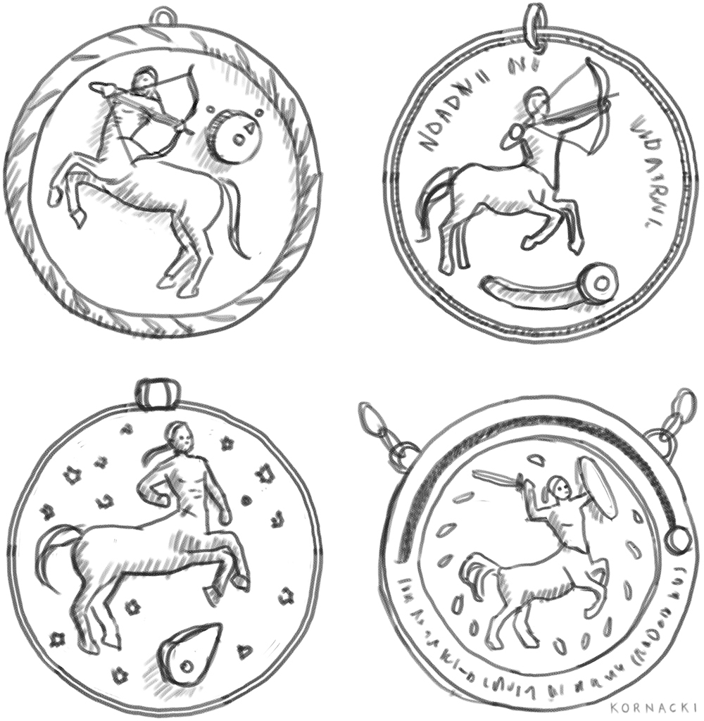
On the back, we decided to include a medallion that plays an integral roll in the story. After the initial thumbnail sketch was chosen, I then did thumbnail sketches of the medallion itself, and we ultimately decided on a mixture of the first and second drawings.
Medallion Thumbnail Sketches
Final Medallion Sketch
Sketch
Final Full-sized Value Sketch
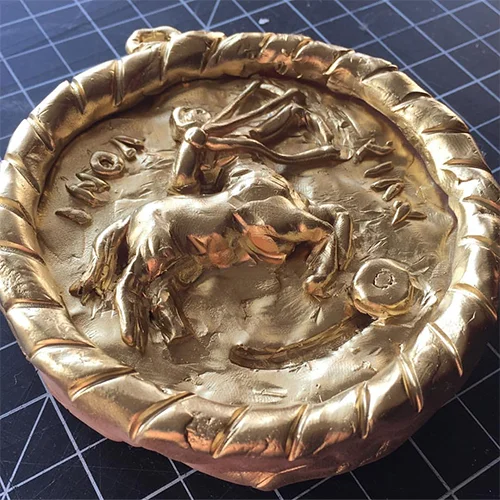
Medallion sculpture
After the Thumbnail sketch was chosen, I proceeded to make my full-sized value sketch. This first involves gathering all my references. I hired models to pose for the main characters on the cover, I bought a figurine of a great dane to stand in for my references of the dog, and I sculpted the medallion out of Sculpey clay and gold spray paint
I then put all those elements together to use as references to create my value sketch. I envisioned the sketch to be pretty dark overall, which would help emphasize the glow coming from the machine. I knew the tough part would be making the black great dane stand out from the dark background. This sketch was approved without any revisions!
Color Studies
Color Studies
Final Color Study
Color can make or break any composition, so before I start painting, I always make some digital color studies. Using my value study, I digitally overlay colors on top of my sketch. This helps me envision how all the final elements will come together.
I originally pictured this painting with an overall blue color scheme. I kept all my color studies in the cool color field and played with using a teal or a magenta to enhance it. The trouble was then what colors do I use to make sure the characters stand out? After several revisions, we landed on blue and teal with Wily wearing a goldish/yellow color that would match the medallion.
Oil Painting
Then all there was left to do was to transfer my sketch on the board and then to paint. I ended up painting the medallion on a separate canvas, so that the designer had the ability to move it around to best fit the text. The lightning was a particular challenge when figuring out how to paint it. In the end, I decided to glaze the lighting on top, in several layers. Watch my timelapse video above to see it come together. Viola!
"Wily", 19.5" x 14", oils on panel


